
Smoother Async Audio Conversations
Designing for effortless audio interactions and deeper group engagement

Salt+Light's core feature "Riffs" had potential to drive user retention, but its clunky user experience was creating unnecessary friction. I redesigned the audio recording and conversation flow to remove barriers and transform one-way responses into dynamic conversations.
1.0 Riffs Demo
Timeline
V3: 2 Months
2024
Team
1 Stakeholder (CEO)
1 Product Manager
2 Engineers
Role
Product designer
Results & My Impact
Improved usability & Asked the hard questions
The app was sunsetted before we could measure long-term impact of this feature and I encouraged the team to pause on building so that we could figure out what problem we were solving with our product.
However, throughout the time the product was live, Riffs was a feature that people enjoyed and I even got to connect with people I had never met before through this feature, so I am confident that these changes would have positively impacted the engagement.
Highlights
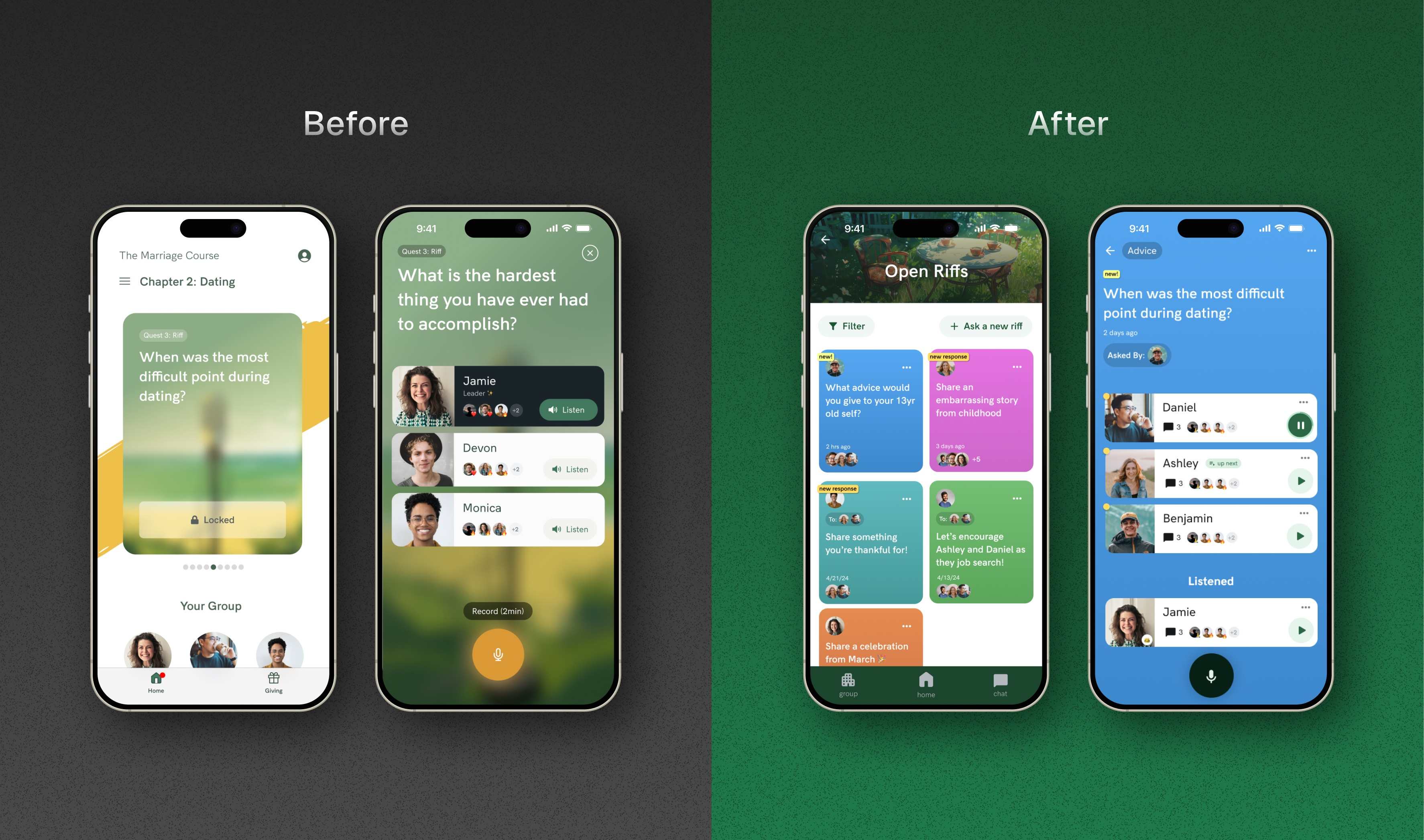
1.1 Riffs Before/After
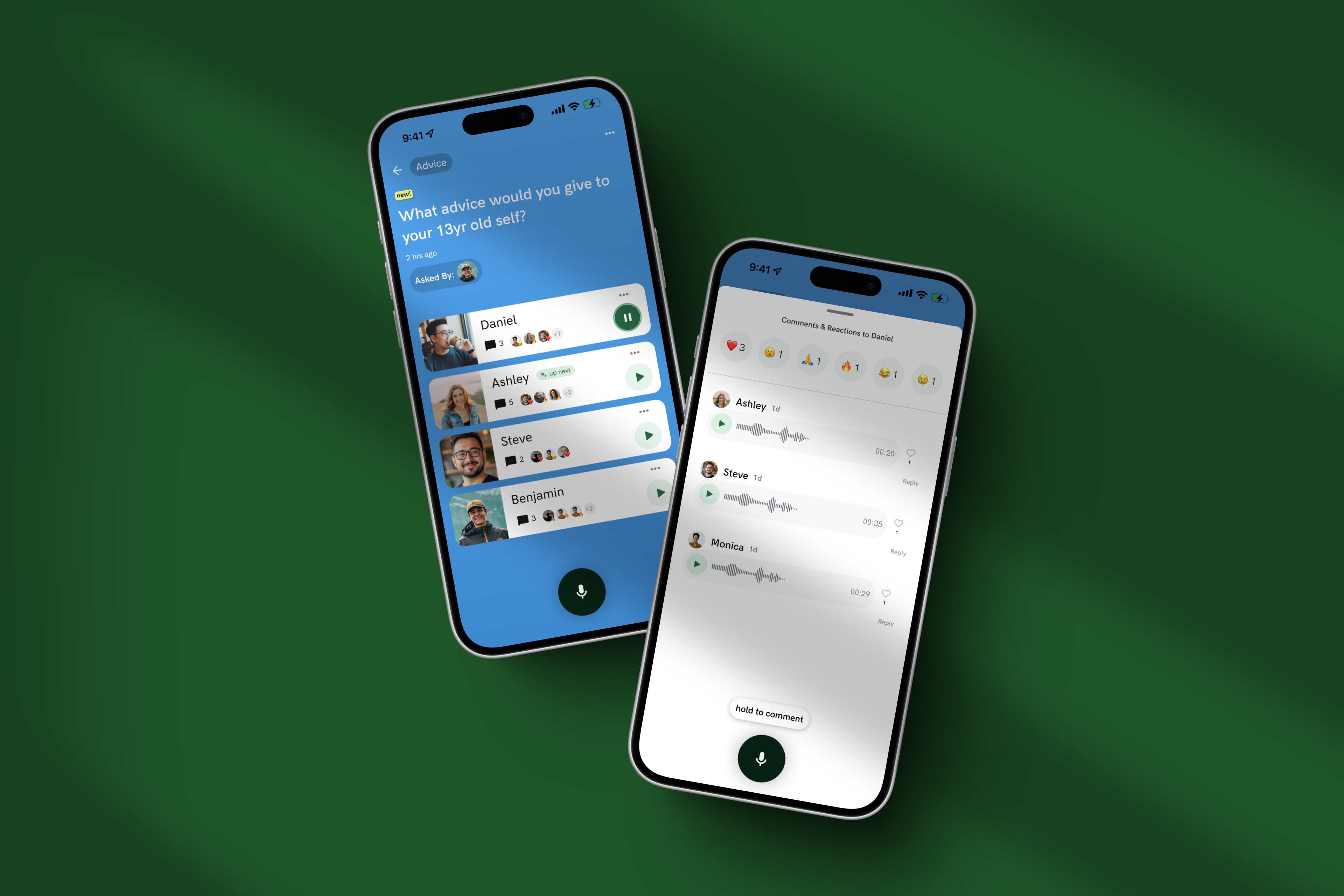
1.2 Riff Comments
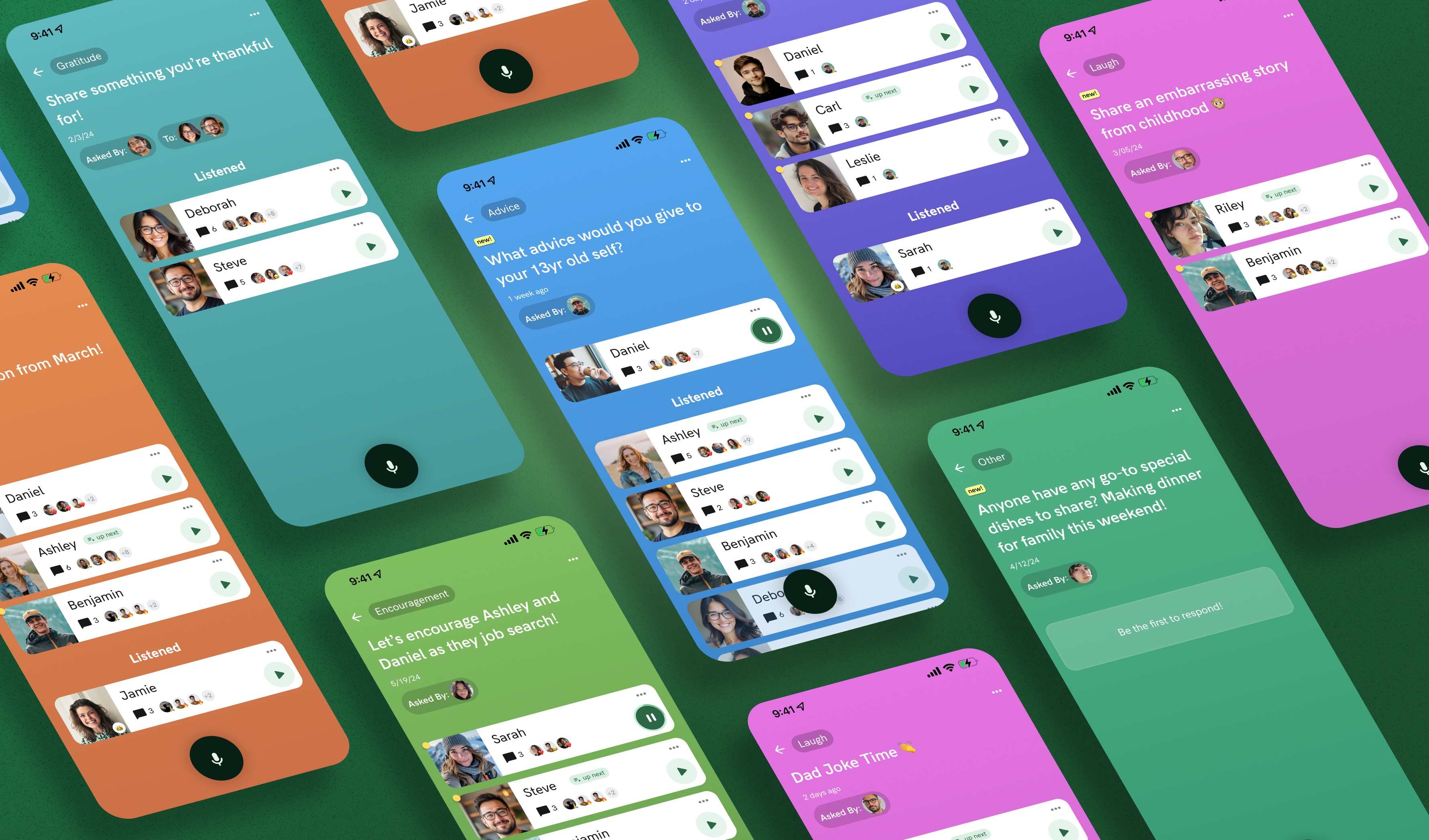
1.3 Riff Categories Showcase
Our biggest bet wasn't working…😬
Client Solution
Group members struggled to engage in meaningful conversation, resulting in declining retention 📉
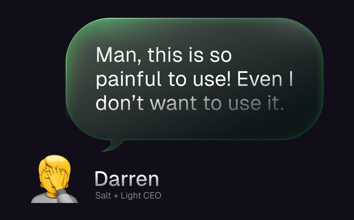
1.4 Salt + Light CEO Quote
PROBLEM
Specific UX Problems
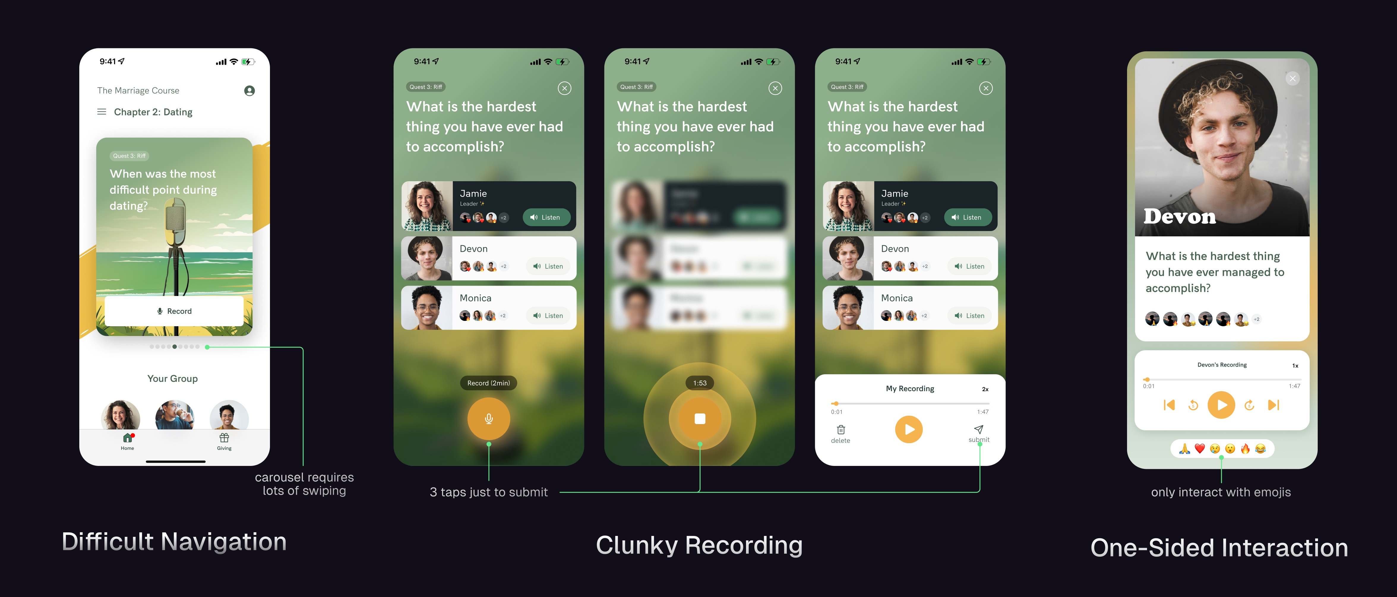
1.5 Specific UX Problems with Riffs
The Riffs feature suffered from three key UX problems:
Difficult Navigation: A carousel interface made it hard to see which questions and responses were new
One-Sided Interactions: Only group leaders could ask questions, and members rarely returned to hear others' answers
Clunky Recording Process: Capturing audio required too many steps, creating friction at the most critical moment
GOALS
Drive Engagement
My objective was to transform Riffs into an engaging feature that could drive retention and attract new users by:
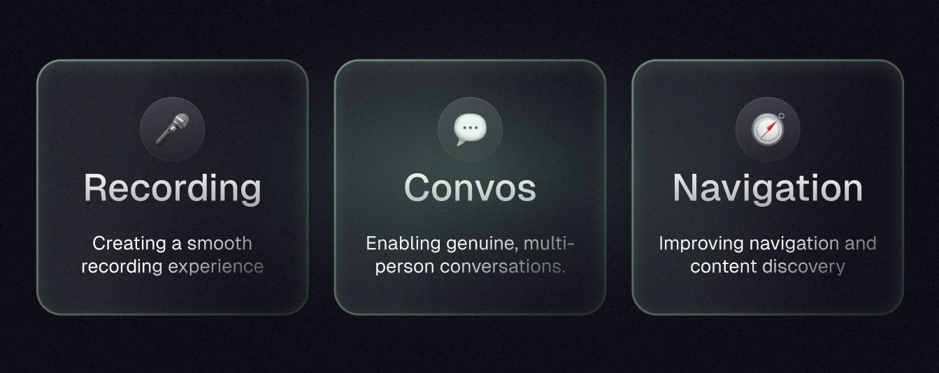
1.6 Design Goals
Assessing what we have
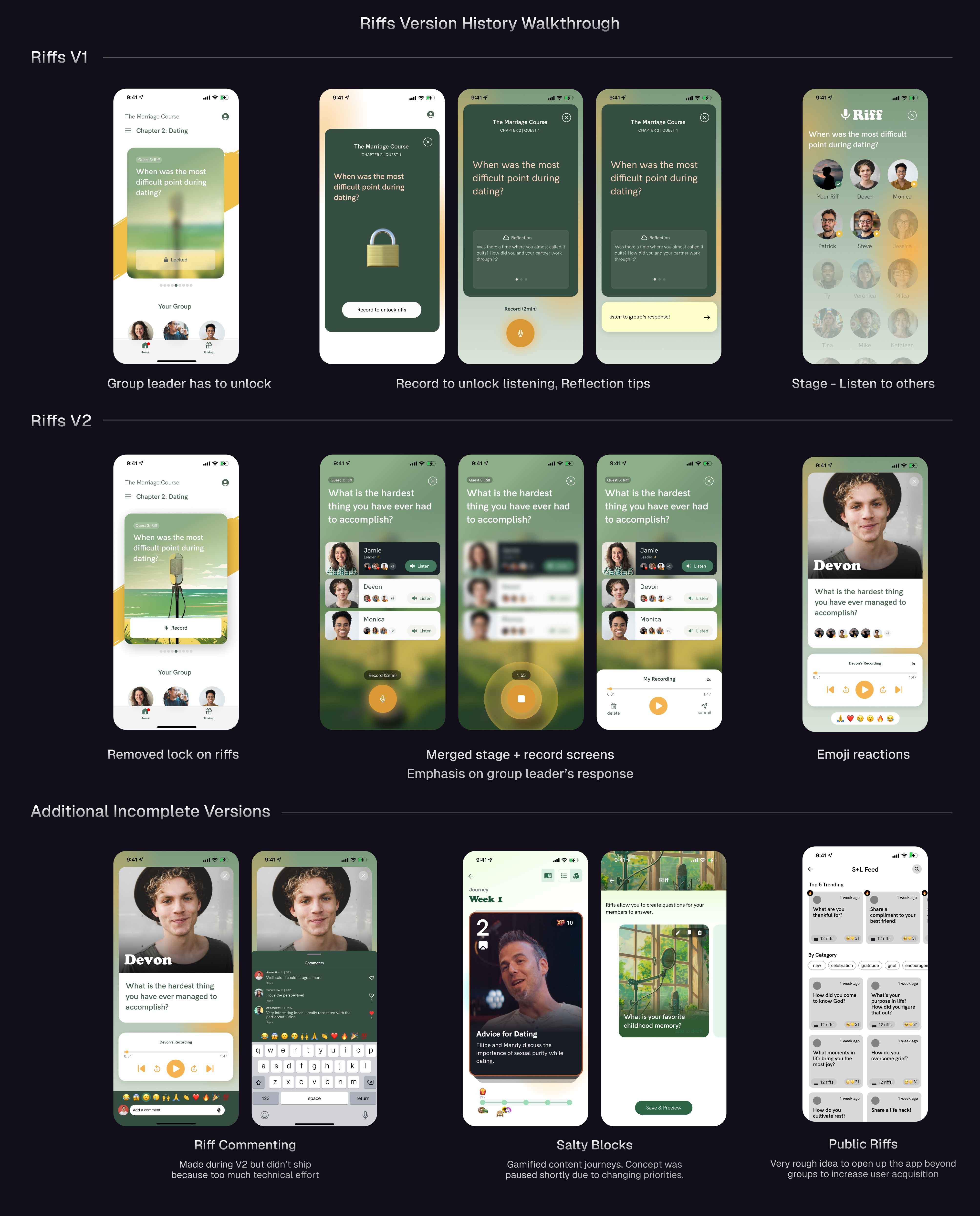
Reviewing Past Versions of Riffs
Riffs had gone through multiple iterations as the product evolved. I analyzed each version's strengths and limitations:
V1: Part of a structured content journey. User had to record their response before being able to listen to others
V2: Combined recording and listening into one screen, added reactions.
Both V1 and 2 had the same problem of discoverability being really difficult.
V2.5: Reorganized the home page into a map-like interface. Added AI generated questions. This is when our app began to pivot a lot, which resulted in incomplete ideas, such Salty Blocks and Public Riffs (see below)
By analyzing past versions and explorations, I identified which elements to preserve and which needed rethinking.
Solution pt 1
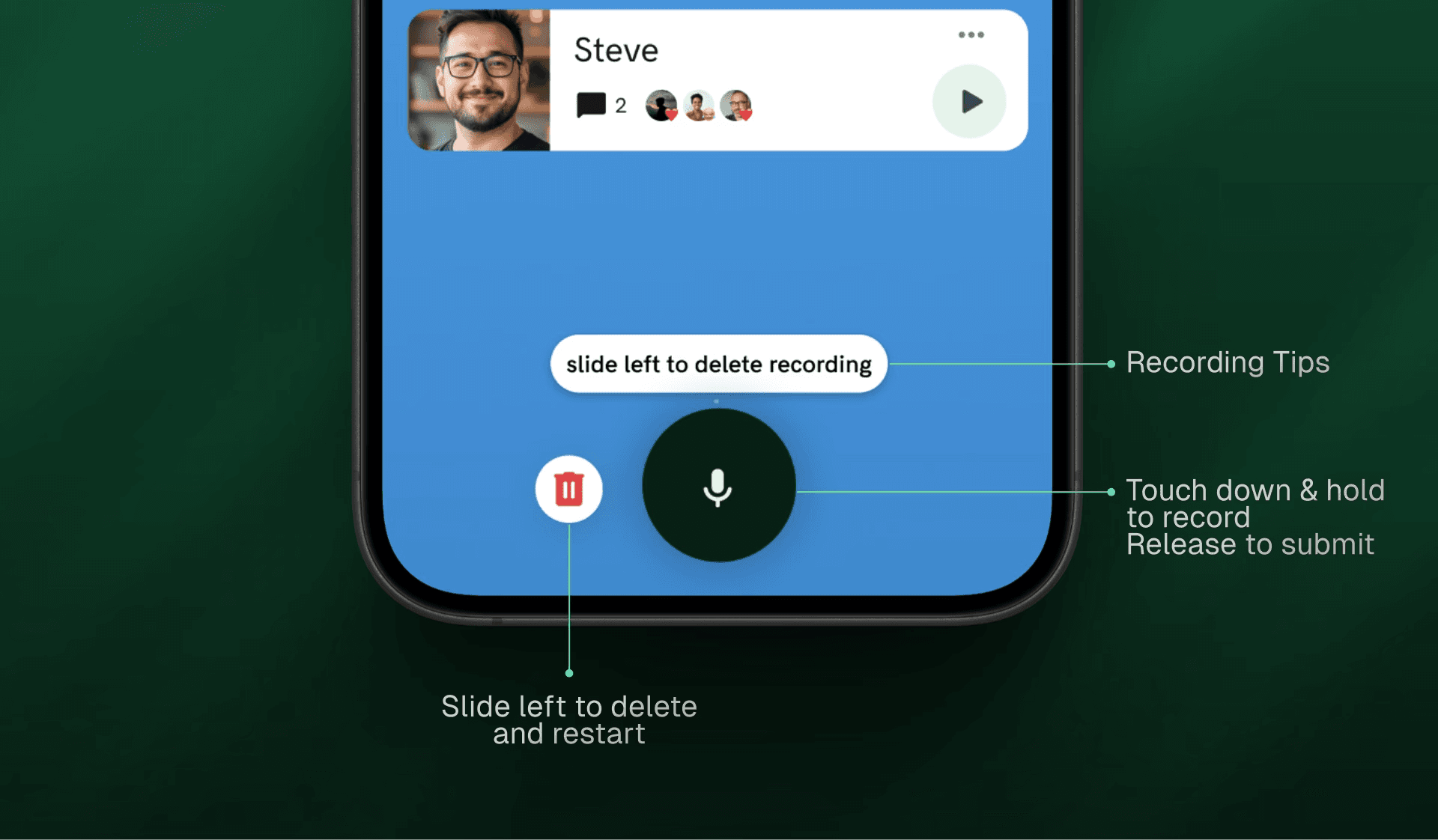
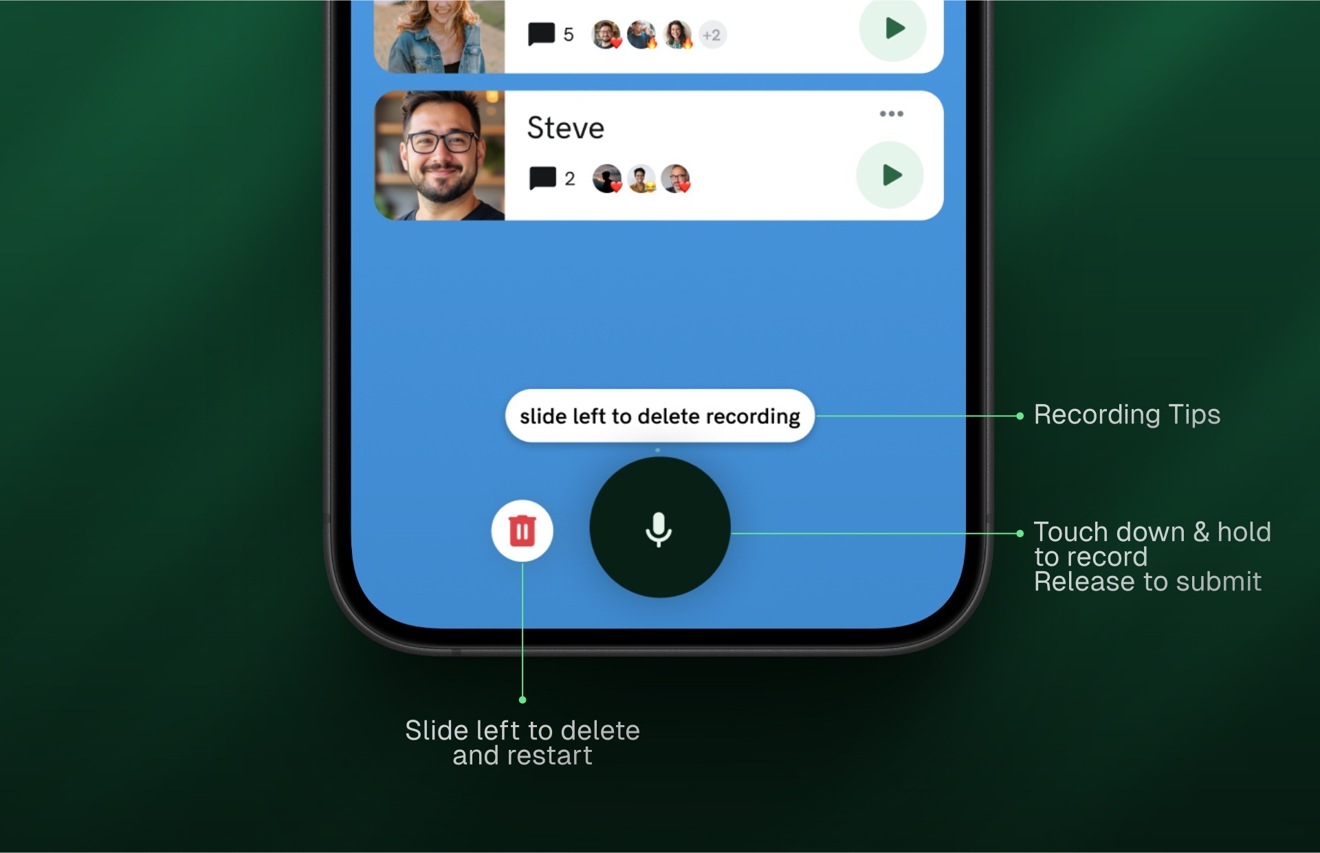
Streamlining the Recording Experience
I reduced the recording process from three clicks to one, benchmarking against popular audio apps with snappy interfaces. This made the core action instant and frictionless rather than feeling like a multi-step process.
2.0 Riffs Recording Demo
SOLUTION PT 2
Opening Up Conversations
I shifted Riffs from a rigid Q&A format to a more organic conversation by:
Allowing any member to ask questions, not just group leaders.
Adding commenting functionality for more interactivity.
Enabling targeted questions to specific members.
2.1 Riffs Creation & Commenting Demos
Solution Pt 3
Improving Content Discovery
The previous carousel interface made browsing difficult, so I redesigned the feature with:
Clear question categories
Visual indicators for new content
A structured layout with 2 columns of cards for the user to browse through
"New" tags and visual highlights for unheard responses
When listening, the responses play continuously like a music playlist until the user decides to stop
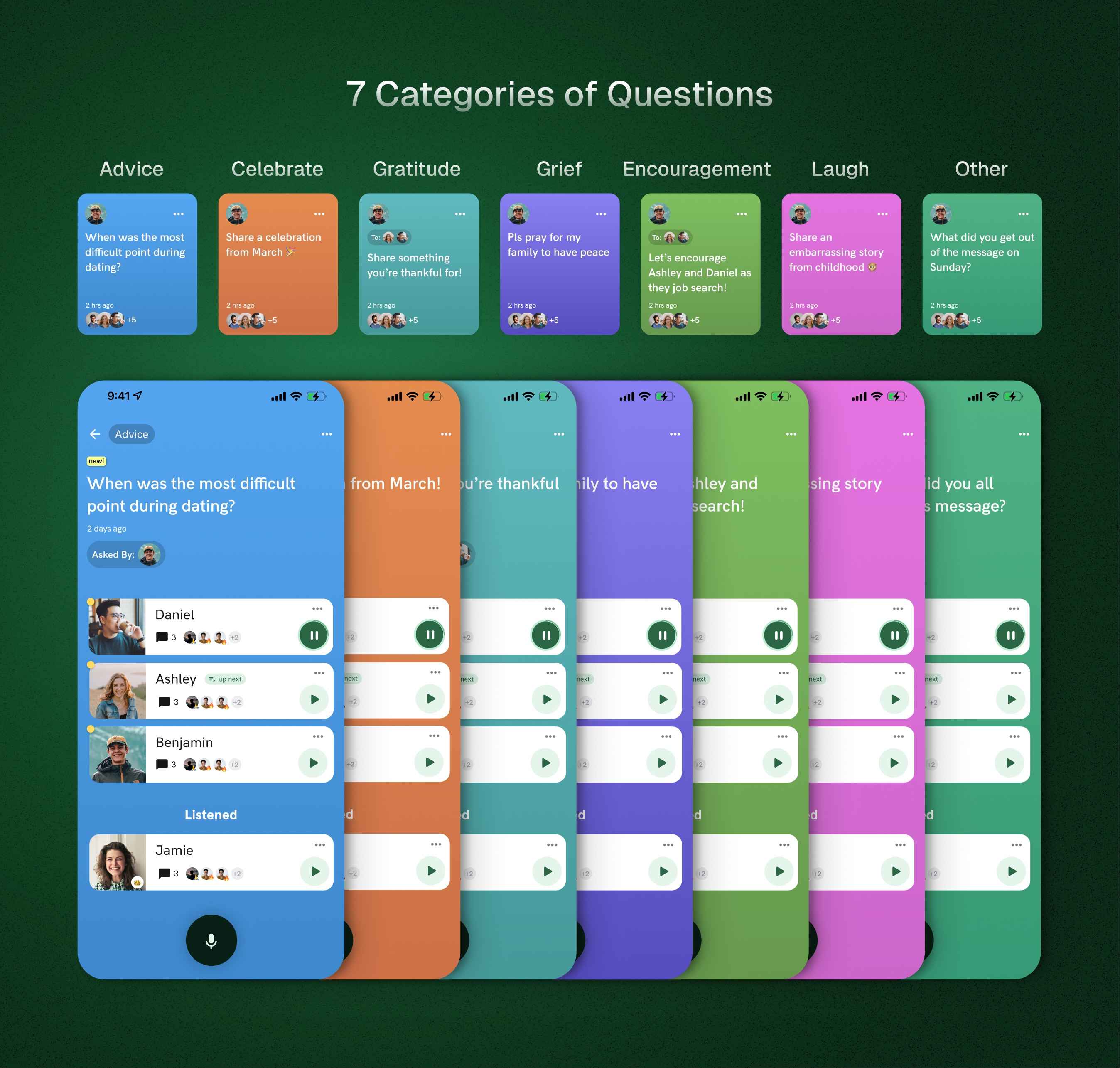
2.2 Riff Categories
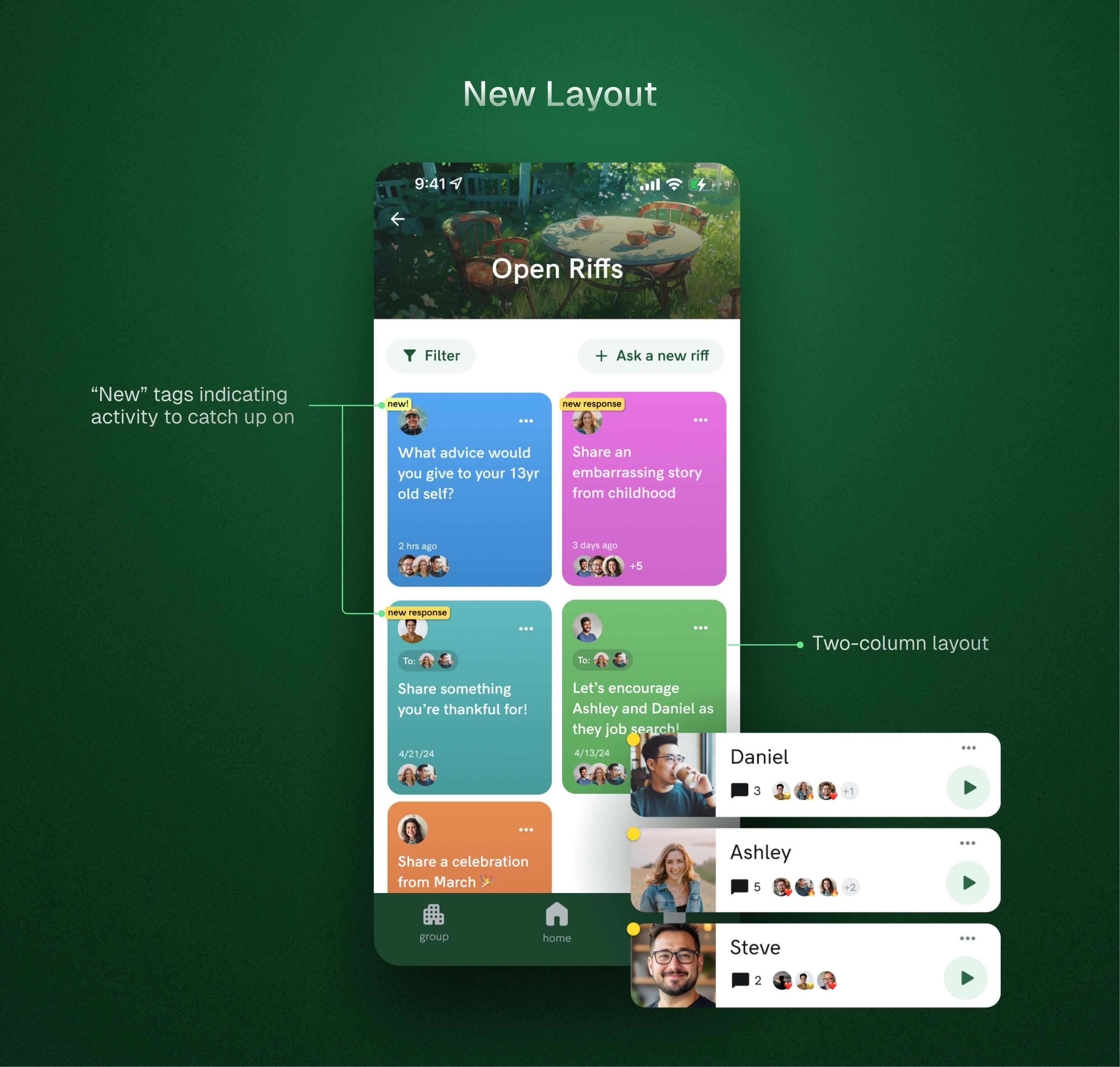
2.3 Riff Layout, Annotated
Results
Sunsetted, but Gained Valuable Lessons
While these improvements enhanced usability, they came too late in the product's lifecycle to measure direct impact before the app was sunsetted. However, the process taught me valuable lessons:
1
Small UX improvements must align with larger product strategy. While fixing Riffs was important, the product faced more fundamental acquisition challenges. It was only after these changes that I encouraged my team to pause and re-evaluate what core problem our product was solving.
2
Audio interactions require attention to friction — every additional step reduces completion rates.
3
Social features need to enable authentic relationship-building. One-way interactions rarely create lasting engagement.
I'm proud of transforming a frustrating experience into something intuitive and engaging, even if market factors ultimately prevented its success. The principles of reducing friction, enabling genuine conversation, and improving content discovery have informed my approach to design challenges ever since.
Learnings
The Importance of Validating Ideas
This project reinforced the importance of balancing tactical UX refinements with strategic product direction. If I were to do it again, I would prioritize earlier validation and usability testing to make sure we were building something people really wanted sooner.
I’ve written a short post about my learnings from Salt + Light here: [LINK]
Despite the outcome, I’m proud of transforming a frustrating experience into something intuitive and engaging. The principles of reducing friction, enabling conversation, and improving content discovery continue to inform my design approach today.
Continue
See more of my work

Simplifying Website Creation with AI
Systematized Website Themes, Less Design Stress
timothea shi