

Simplifying Website Creation with AI
improving the editor interface to increase user satisfaction from 2.7 to 4.3 out of 5
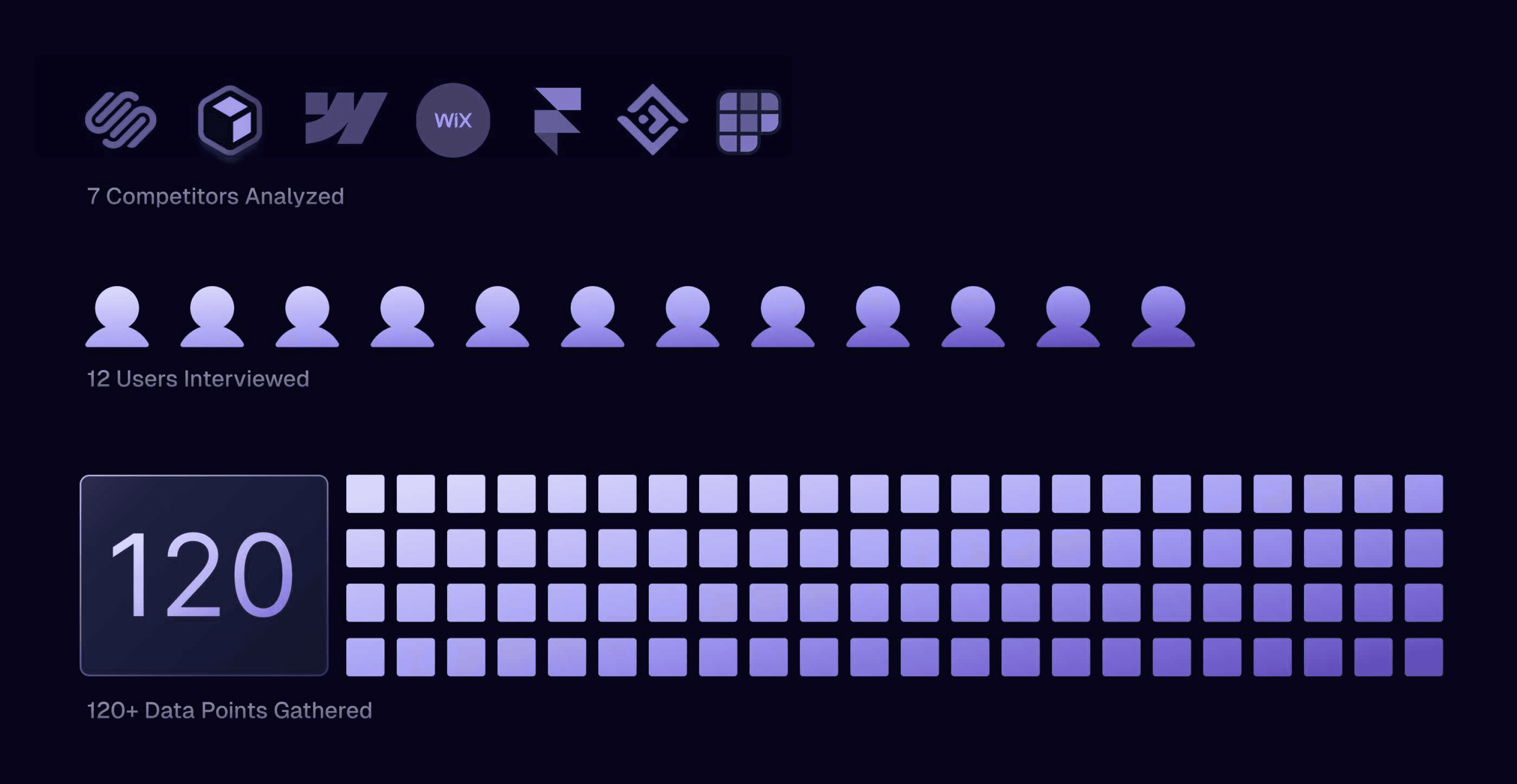
Small business owners were struggling with our website editor, particularly with AI tools and finding the features they needed. Over 10 weeks, I redesigned the interface's information architecture to improve usability for non-technical users. This project impacted 160+ screens and 10 features, resulting in a 56% increase in user satisfaction.
1.0 Homepage Initial Generation
Timeline
3 Months
2024
Team
1 Design Lead
1 Stakeholder (CEO)
5 Product Designers
Role
Product designer, UXR, Prototyping
Universal


Contextual


PROBLEM
Non-technical users couldn't effectively use AI tools or find basic editing features, resulting in a low satisfaction score of 2.7/5.
Butternut’s superpower is generating an entire website from a single “chat GPT”-like prompt in less than 20 seconds. However these UX problems made it hard for users to keep building off of the AI output to create their dream website.
RESULT & MY IMPACT
satisfaction
screens updated
updated features
The new editor design achieves our goal of making an editor interface that’s easy to use for non-technical users and doesn’t get in the way of their editing process.
Most of my personal impact was in defining the design direction of the editor interface and tools with the left toolbar design, as well as in the initial generation through the landing page.


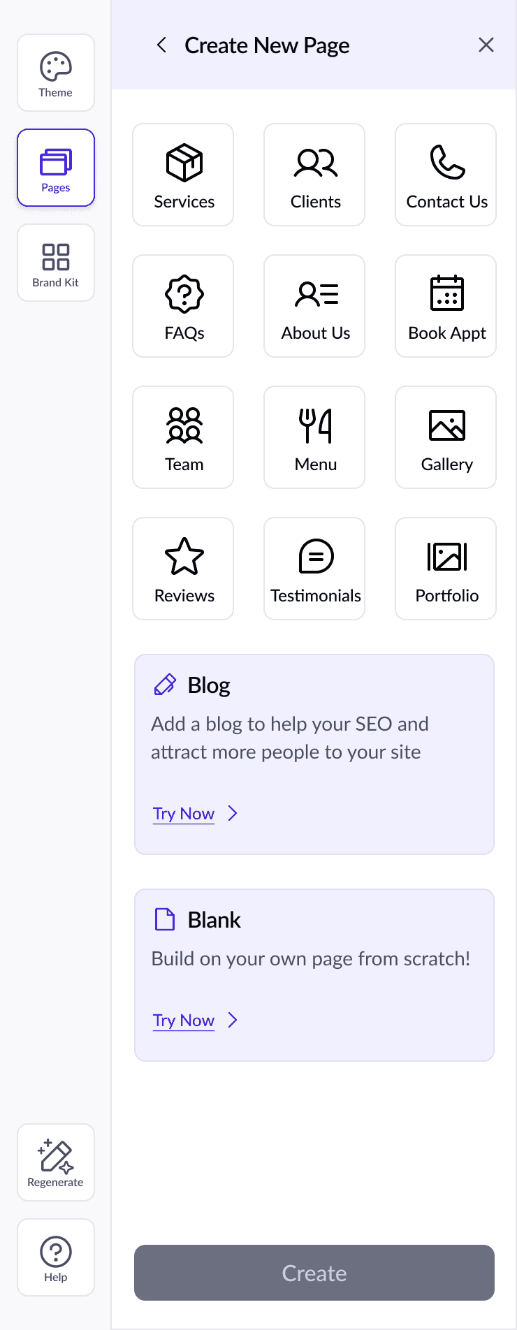
1.1 Editor UI

1.2 Editor UI | Universal Tools
1.3 Editor UI | Contextual Tools
OPPORTUNITY
HMW improve the website editor experience and usability of AI to help non-technical business owners effortlessly design a website they're proud to publish?
USER PROBLEM
UXR Revealed 2 Categories of Problems
Usability of AI
Users struggled to understand how to prompt AI to get their desired results.
Discoverability of Tools
The existing editor interface had confusing labels for tools and made it hard to find them.
DESIGN GOALS
Editing Needs to be Frictionless
Minimal: the editor needs to be minimal to not overwhelm users or obstruct editing
Clear: tools need to be clear on what they do
Organized: tools need to be organized in intuitive hierarchy for easy discovery
User Goals
Decrease confusion when editing
Business Goals
Shorten the amount of time between start to publish
SOLUTION PT 1 | USABILITY OF AI
Clarity is KING when Designing AI Products
People struggled with the initial site prompt on the landing page because they didn’t know what to add and how much to add for effective results.

2.0 User Problems with Starting
2 Flow Ideas that were Too Long
Our team explored 2 different ways of onboarding. I tried designing for co-creation, where the user collaborates with the AI to get the desired output.
This method contrasts the current experience where the final output of the website is given to the user in a few seconds.
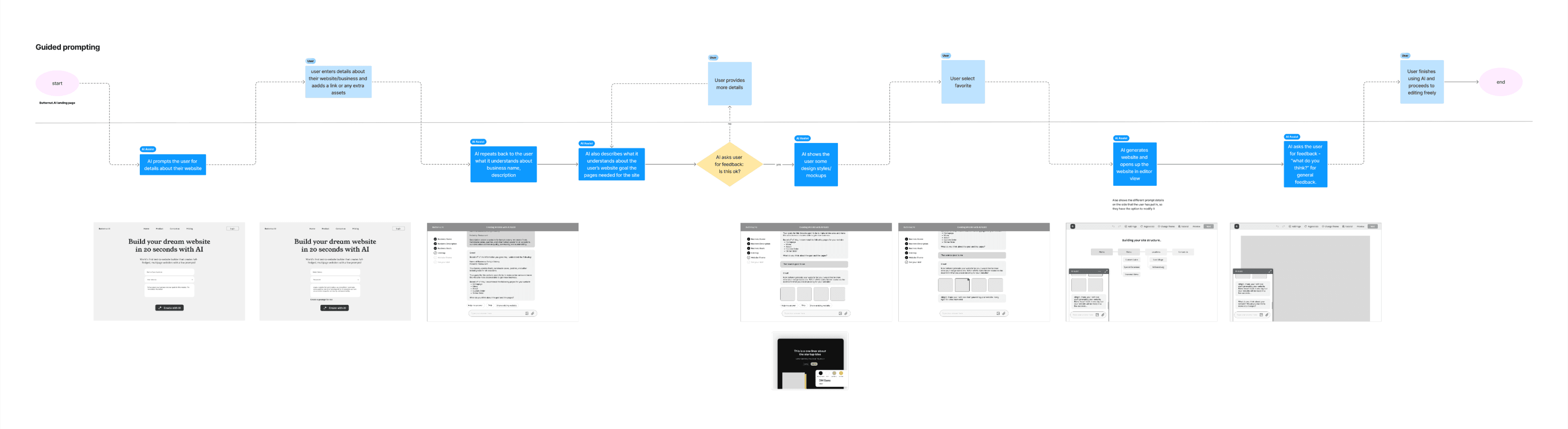

Shortening the Flow
We ended up shortening the flow, and the final design includes example sites on the landing page that users can duplicate or modify the prompts of.
This delivers in 2 ways.
1) Users are given a preview of what sites they can build and it subconsciously sets their expectations.
2) It serves as inspiration for prompts users can write.
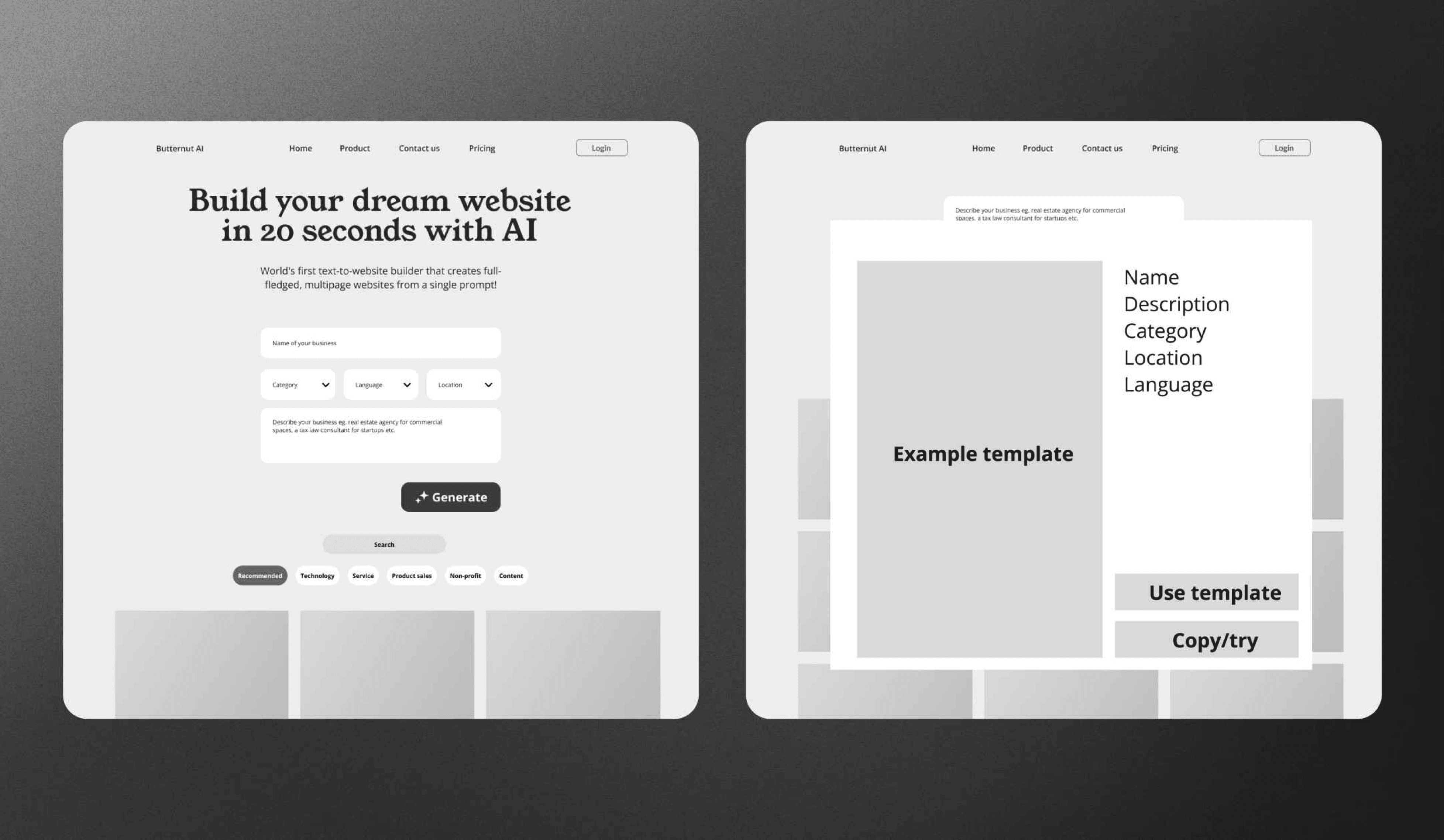
2.2 Landing Page Wireframe

Positioning AI as an Assistant
AI tools were unclear and labels were only available (sometimes) on hover.
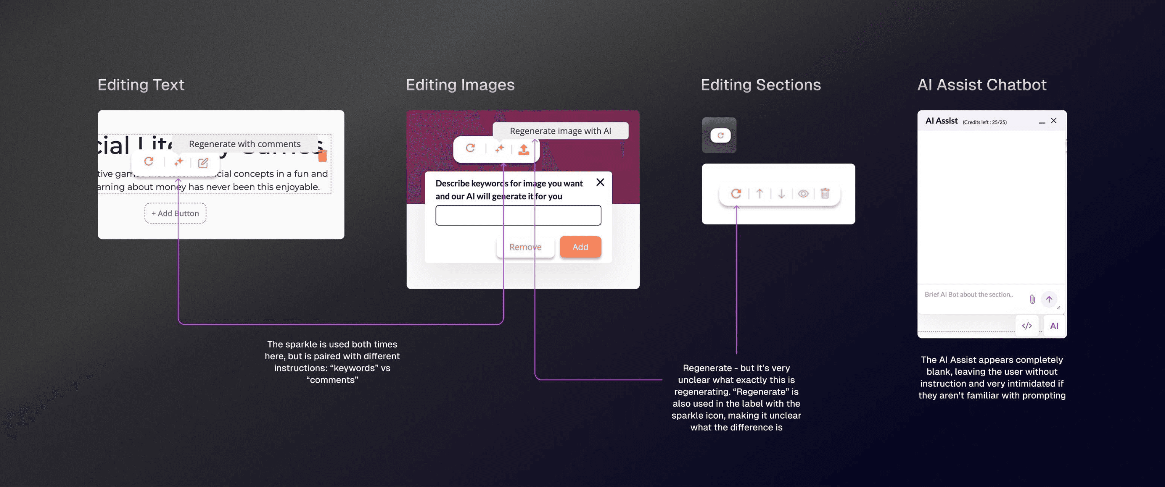
2.5 Problems within AI Tools (Before)
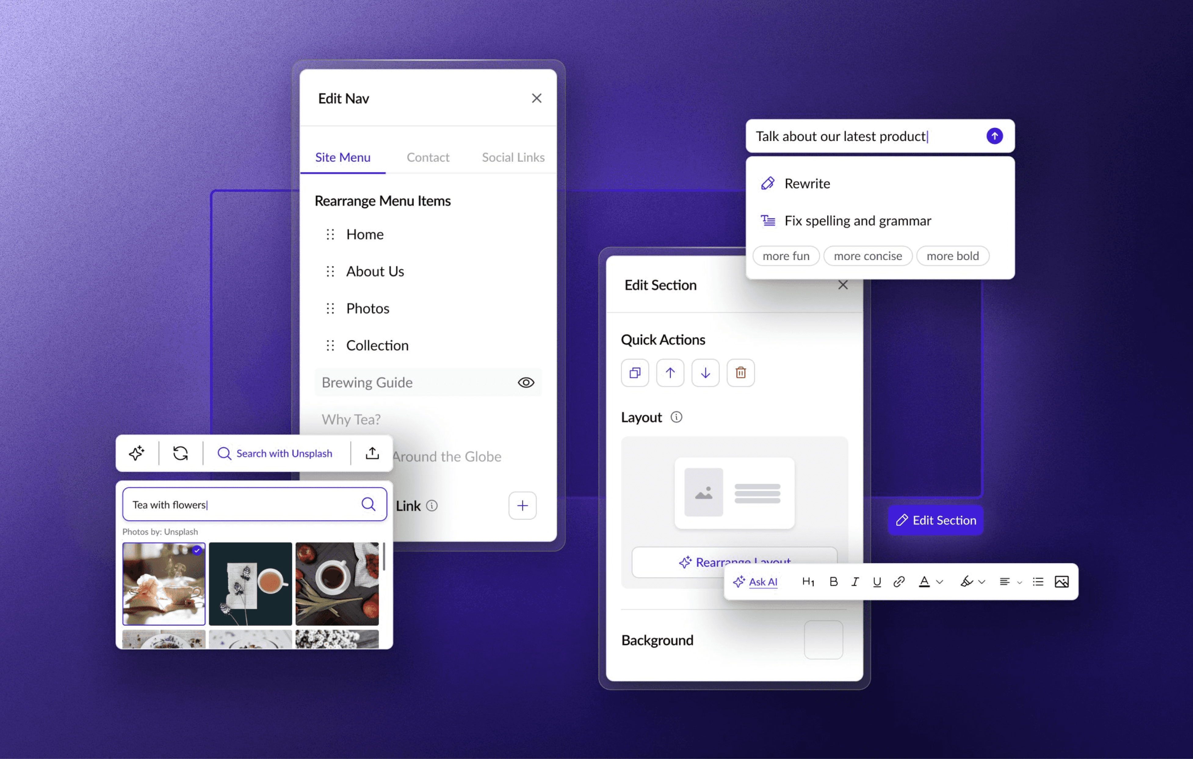
I redesigned the AI elements with clear icons and labels instead of using generic "sparkle" icons everywhere.
If everything is a sparkle, it makes AI seem like magic and cause a disconnect between user expectations and actual functionality. Clear labels can help bring the most relevant, most important tasks to the user’s mind.
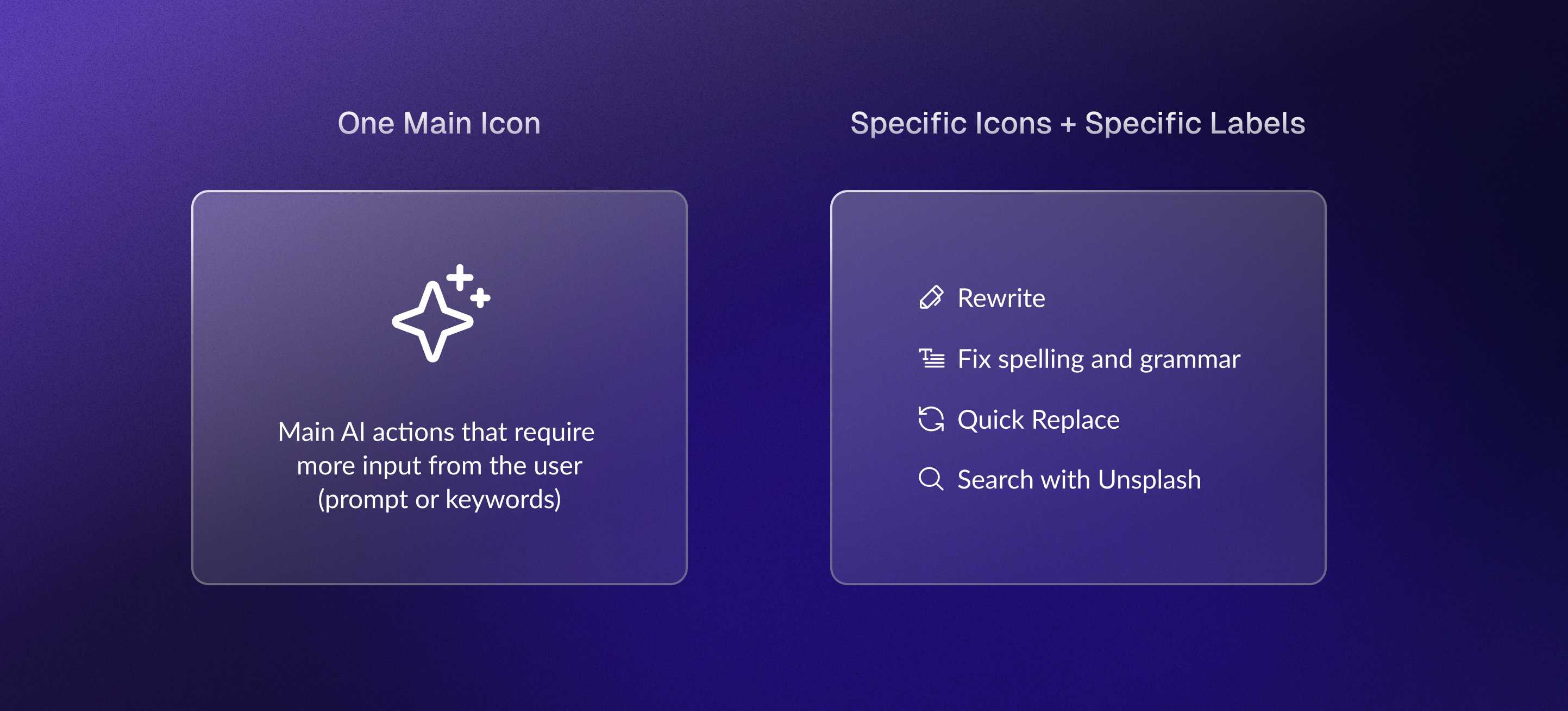
2.6 My Approach to Clarifying AI Tools


2.7 AI Tools (After)
Solution Pt 2 | Discoverability of Tools
Organize for Streamlined Editing
Tools were scattered and hidden, with unclear usage instructions. Tool modals covered the website they were editing, so users couldn't see what they were changing.

3.0 Editor Interface Breakdown
Working with Client Constraints
Because of client request, we had to prioritize keeping the website itself as large as possible.
📢 Client
Two Categories of Tools: Universal, Contextual
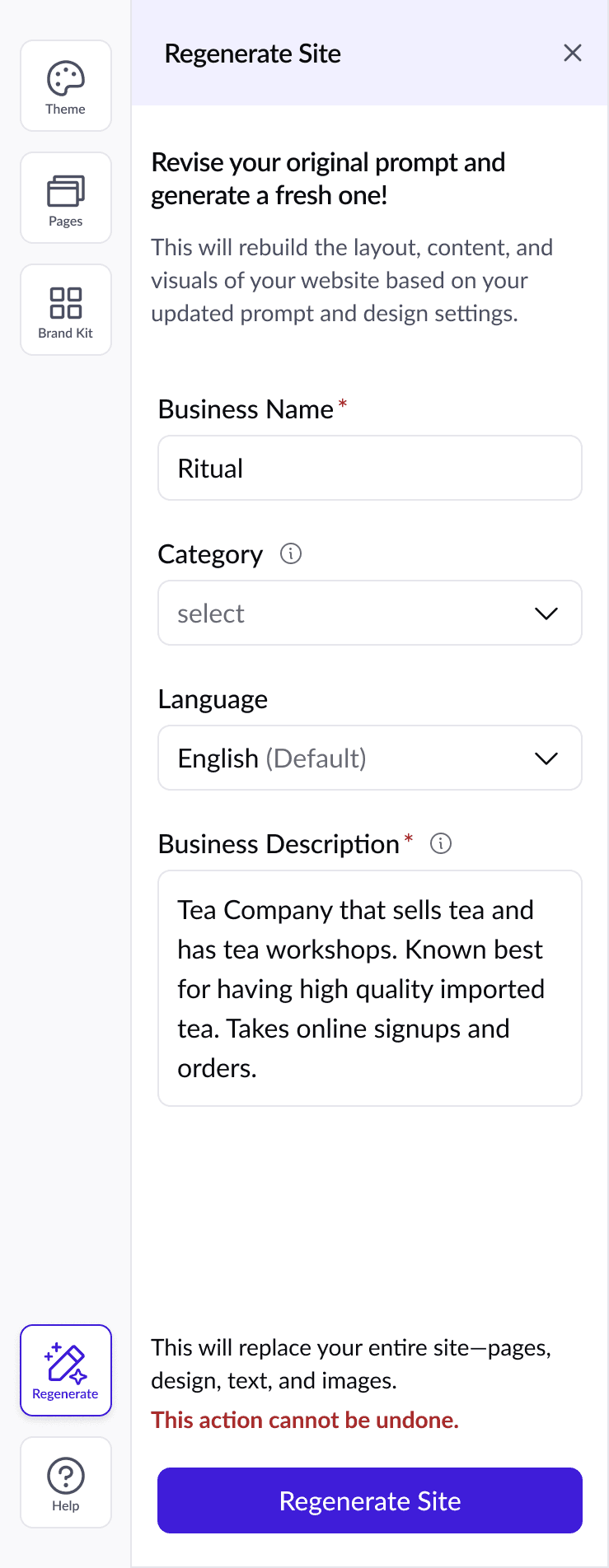
I restructured tools into two categories: universal and contextual, creating different design patterns for each while trying to prevent obstructing the canvas too much.
Universal tools: Consist of global edits and open as a full left side pane
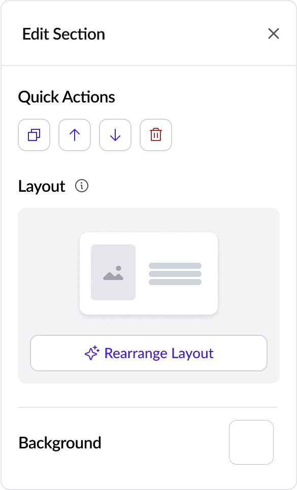
Contextual tools: Detailed actions that open directly over relevant website edits.
3.1 Universal Tools Showcase
The top bar in the interface is now reserved for site management and navigating Butternut (like your home dashboard, going to other projects, publishing your site).
3.2 Contextual Tools Sample | Edit Section
Results
4.3/5 Satisfaction (+56%)
The redesign increased user satisfaction. Users had no trouble finding tools during usability tests, and their feedback highlighted the clarity of both AI features and tool organization.
Continue
Dive Deeper
If you're interested in learning what else I worked on in this project, continue reading part 2.
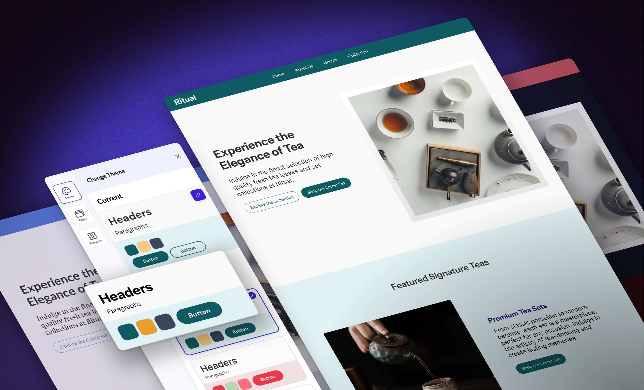
Systematized Website Themes, Less Design Stress
timothea shi